You need both form and function
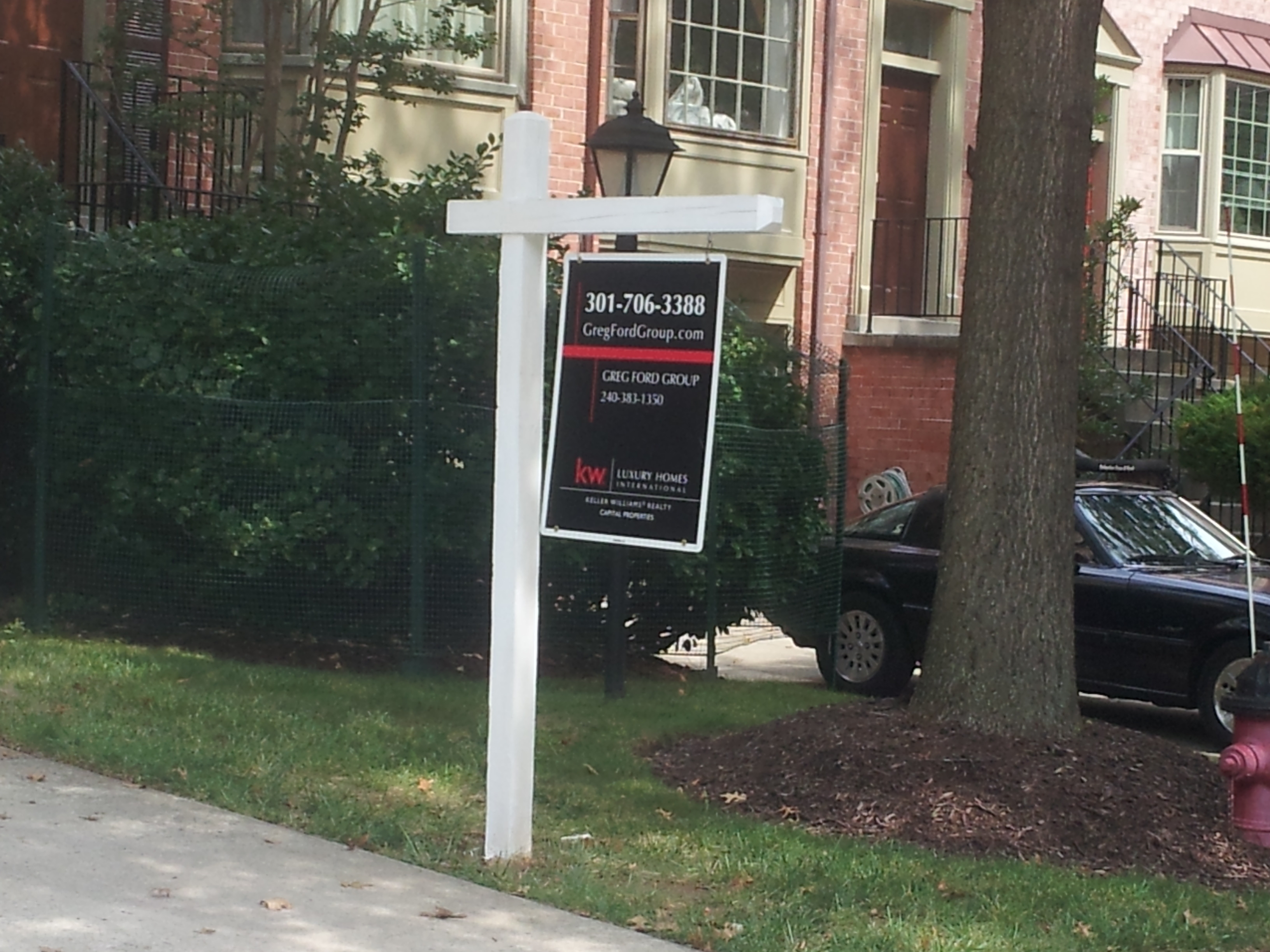
One of the houses in my neighborhood has recently gone up for sale. I presume it did anyway because this is the sign that went up in front of the house:
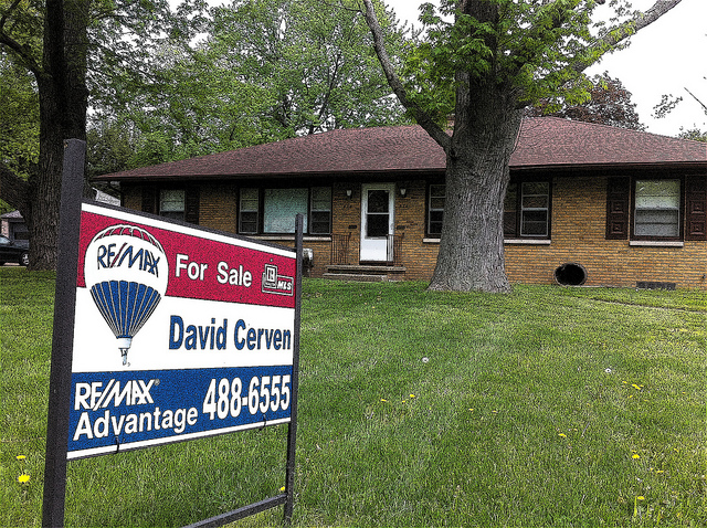
We’ve all seen for sale signs in front of homes. They generally look like this:
Notice anything different between these signs?
It seems that this is a case where a company is so anxious to have their format look different than the competition that it forgets about the function.
You can barely make out the telephone number and website of the realtor in the sign at the top. In fact, you’d probably have to drive right up to the sign (and perhaps that is the intent). Also, the sign at the top does not have the words “for sale” anywhere on it. Someone passing by does not know if the house has already been sold or if it is for rent.
So the next time you are itching to change your graphic identity, remember that you need both form and function. If you don’t consider what the piece is for, and how people will interact with it, you won’t be doing a good job of communicating.
What do you think? Does having a real estate sign that looks markedly different than others make your home stand out?